Did you know there is a color wheel of emotions?

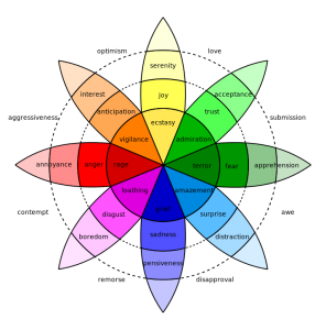
Psychologist Robert Plutchik’s psycho-evolutionary theory of emotion is a very influential classification approach, shown above. He considered there to be eight primary emotions—anger, fear, sadness, disgust, surprise, anticipation, trust, and joy. Plutchik proposed these “basic” emotions are biologically primitive and have evolved to increase reproductive fitness over time. He argues each is a trigger of behavior for survival, such as fear inducing the fight/flee/ freeze response.
Plutchik’s theory considers all other emotions as mixed (or derivative states) of the eight primary emotions. In his model, all emotions vary in their degree of similarity to one another. Also, each emotion can exist in varying degrees of intensity or levels of arousal. He developed his “wheel of emotions” color wheel model in 1980.
His suggested eight primary “bipolar” emotions are: joy versus sadness; anger versus fear; trust versus disgust; and surprise versus anticipation are shown in the second circle. The inner circle shows a higher level of intensity of these emotions. The outer circle shows lower levels of intensity of these emotions.
I think the metaphor of a color wheel is effective because like colors, primary emotions can be expressed at different intensities and can mix with one another to form different emotions.
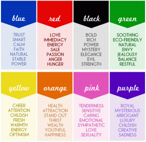
Artists have been using colors to reveal emotions and moods for eons… feeling “blue” (down, depressed), light blue can suggest calm, seeing “red” (rage, danger, even pulsating life), “green” has been used to show “growth” and black used to show grief, evil, or penitence. Emotions and colors are closely tied together. Plutchik’s model is creative and enlightening. It shows feelings according to intensity (strongest in the center, weaker as the flower blooms outward). However, there are some emotions still missing.

Ramiro Puentes is an outstanding artist, photographer, painter, sculptor and poet who uses color to express his moods. He’s risen from crippling poverty and used art to save himself and reimagine the streets of Skid Row in downtown LA, California. Skid Row contains one of the largest stable populations (between 3,000 and 6,000) of homeless people in the United States.
Ramiro explains which colors he identifies with and why in this VERY INSPIRING video.
[youtube]https://www.youtube.com/watch?v=1ISzbISheiM[/youtube]
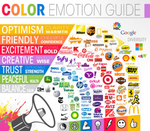
Our emotions have indeed evolved over time for our benefit and the survival of our species. The color wheel attempts to depict this (no model is perfect). The business world has certainly capitalized on our color/emotion connection in their marketing strategies. When we feel compelled to buy something, color can play a major role. Analytics company KISSmetrics created an interesting infographic on the science of how colors affect our purchases. Clearly, every one of these companies is seeking to trigger a very specific emotion that will result in our buying their product.

Our heart’s higher purposes of “connectedness” and “relatedness” to others have helped us to survive and thrive (as Ramiro’s video shows). We’ve also learned the value of “transcendence.” There are times when certain emotions must be set aside so we can pursue a higher dimension or purpose. Artists and creatives have learned how to express whatever emotion they need to–in whatever colors–in order to transcend to the next level… and we all get to learn in the process.
What colors match your emotions? How do you express them creatively? Are there some colors you naturally gravitate to? I know when i go to my closet and put on black, its because I’m mellow, peaceful (not depressed).
Thank you for reading my post. My core message of ‘everyone is creative’ resonates with people of all ages and walks of life. I invite all to become–the best version of themselves and find true meaning by pursing long term creative quests–in my recent book and website.


VERY interesting, Betsy! I guess my colors are blue and black. I always thought I liked blue because it makes my eyes look good and black because I can do so much with it. Hmmm . . . very interesting. Thanks!
Once again… a very interesting and insightful post! I know that color, for me, is something that I can’t live without, it is like a visual music. Each hue and tone relating to various notes and melodies. It is also interesting to me to see the different emotions that have been paired with certain colors and ranges of colors. To me, the take away is that as with most sensory art, the personal meaning still lies in the mind of the beholder.
Hi Melanie,
I could not agree with your wise words more — “The personal meaning (of color) still lies in the mind of the beholder.” Thank you for posting Mel!